Perfect Images, previously known as WP Retina 2x, not only takes care of the Retina (high-dpi) images automatically, but also helps you controlling your image sizes, optimizing them and serving them (through a CDN, for instance).
Optimize your Image Sizes
Do you know what are we call image sizes in WordPress? It’s an important concept, so please have a look at this first if you don’t know about it: WordPress Images Sizes.
The image sizes are registered by your WordPress, by your theme, and other plugins, and all those sizes are generated for every image you have in your Media Library. They aren’t shown anywhere. Luckily, Perfect Images can not only show those sizes to you, but also you to enable them, or not. In the Settings, you will find this screen.

In my example, I am running a WordPress site with the TwentyTwenty theme. This theme adds the post-thumbnail and twentytwenty-fullscreen sizes. WordPress adds all the other ones, and yes, it’s quite a lot (and too much).
What are those sizes for?
If you read the article I mentioned earlier, you probably know. But in short, all those sizes will be used (in the HTML) for every image used on your website. Automatically, the most suitable size will be picked by the Internet browser of the visitor, and used for the actual display. The more sizes you have, the more choice the browser will have. The browser picks that size dynamically, depending on the device it is running on, the connection speed and other factors.
The downsides of those sizes? The more you have, the more space it will take at your hosting service. But not only: the related metadata is part of the database, makes it heavier and slower, and certain operations with images will run much smaller, and more expensive (in the case you are using an image optimizer, for example).
Which sizes to use?
The medium_large is quite useless (there is a reason it exists but with the Retina support brought by Perfect Images this size is even more useless), so you should disable it.
The other ones depend on your website. If some sizes are really close to each closer in term of dimension, you probably don’t need all of them.
I personally disable almost half of those sizes at first. Then, if I noticed the browsers are struggling to find sizes which are big enough (you will know that easily, the images would be blurry in this case), you can simply enable them.
Regenerating the Thumbnails / Sizes
If you modify the sizes, you will need to related thumbnails. For this, you can head up to the Perfect Images Dashboard, and click on Regenerate All Entries. You can also click on Regenerate on each individual image.

This will re-create not only the thumbnails related to those sizes, but also the new metadata. You can directly see the impact on your website, and inspect the content of the src-set of your images in the HTML. If you are a bit technical, you’ll probably enjoy this a lot.
Impact of modifying the Image Sizes
There are no negative effects in such, but you should probably make sure all your cache are cleared, and check your website for 404 errors. For some reason, sometimes, old pagebuilders (or maybe you, by mistake) use directly a certain thumbnail, so it’s better to check for those.
Another issue might be that some files, the old thumbnails, are still left in your uploads directory. Those are tricky to get rid of manually, but you can install the Pro version of the Media Cleaner to do that job automatically for you (using the Meticulous Check method, explained in the Tutorial of Media Cleaner).
Configure Retina Support
On the previous screenshot above, you probably noticed the Retina column next to each size. Enabling it will create Retina images every time new images are uploaded or when the sizes of those images are being generated (we often refer to this as regenerating the thumbnails).
How does it work?
Quickly: Retina images are created based on your original image, they are added automatically in the HTML related to your images, and they picked up automatically and logically by the browser used by your visitors depending on their device, screen dimension and so on.
In fact, the same thing happens with the thumbnails generated depending on the different image sizes set up in your WordPress. This is part of the Responsive Images system built on WordPress, and you can learn more about it here. However, unlike those thumbnails, retina images aren’t registered in the metadata. Which is better and more logical; it will not appear anywhere as an option, nor a clutter, and will not slow your WordPress in any way.
Which sizes for Retina?
By default, the plugin enables Retina for the smaller sizes and avoid the bigger ones.
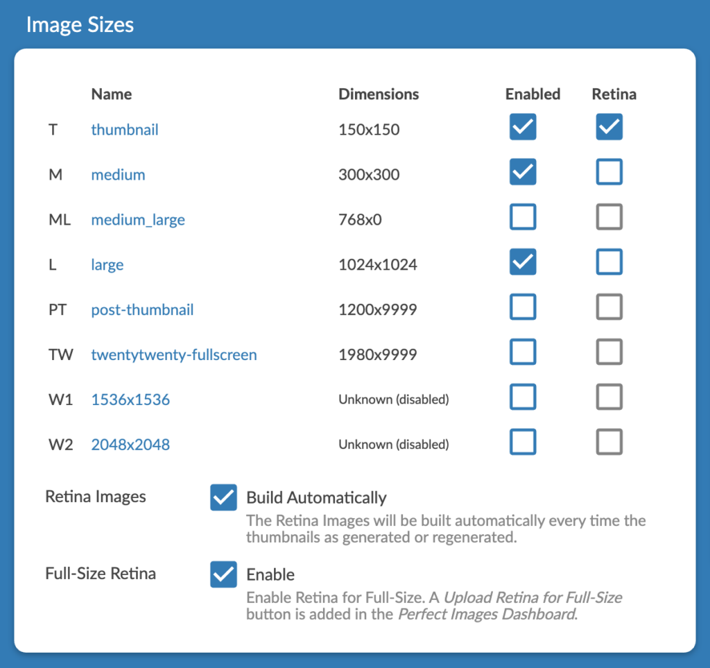
The reason is that you probably don’t need to have it enabled for those bigger ones. The reason? They are big already, and will already appear Retina to most screens.
Remember: For an image to appear as Retina, it needs to be at least double (or more depending on the screen type) the size of its container. For example, on your site, if the container of your image is 800x600px, the image inside will need to be served at 1600x1200px.
Creation of the Retina Images
If you would like the Retina Images to be created automatically, make sure Build Automatically is checked.
The Perfect Images Dashboard will give you more information about the status of your Retina Images, with some ways to build/delete those images as well.

Most of the functions here are self-explanatory. Don’t be afraid to use the Build Retina for All Issues (the first time) and the Delete Retina for All (which only delete Retina Images. If you are curious, you can check your uploads directory to see what is happening!
The status of your Retina Images is indicated in the Retina (Thumbnails) column. Each square represents a specific size. For me, the first is thumbnail (T), the second is medium (M) and the second is large (L). Now, what is happening for each of those sizes?
- Blue. The Retina Image exists, we’re good.
- Yellow. Everything seems fine but there is no retina yet, try the Build button and that should turn into blue in matter of seconds.
- Red. The retina file doesn’t exist and something is missing for the plugin to be able to create it. Hover on this with your mouse, and you’ll know more about the issue, but generally, it means that the dimension of your original file is not enough to create this specific Retina Image.
You can Ignore a certain image if it’s a special case. That will just remove it from the Issues.
Retina for Full-Size Images
In some case, like the logo or specific (and usually small) images, you don’t use a specific image size when using them, you just use the original – Full-Size – file that you uploaded. Some people also ONLY use Full-Size everywhere, and they don’t use the image sizes at all. Of course, the plugin can’t generate a beautiful crispy retina image from thin air. What to do?
If you are a non-pro user, you will need to upload this Retina image by yourself, probably by FTP, using the @2x convention for naming files.
If you are a Pro user, you can use the Retina Dashboard to upload the Retina for full-size. You don’t need to name it or size it, you just need to make sure the image is big enough for the Retina (or the dashboard will tell you that it is too small, try it) and drag & drop it in the Full-Size Retina Upload.
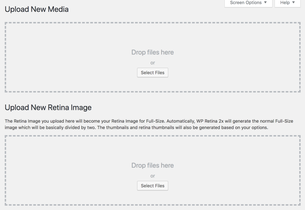
Alternatively, if you would like to optimize your process and only upload one file every time, you can upload your photos directly from the Media Library as Retina for Full-Size! The normal full-size will be automatically generated (that is the Retina divided by two).
Check the
Deliver Retina Images
By default, the method is Responsive Images. This doesn’t require any additional processing on WordPress, and it’s by far the best. That also means that all the plugins (and the theme) you are using rely on the Responsive Images system; otherwise it will not work.
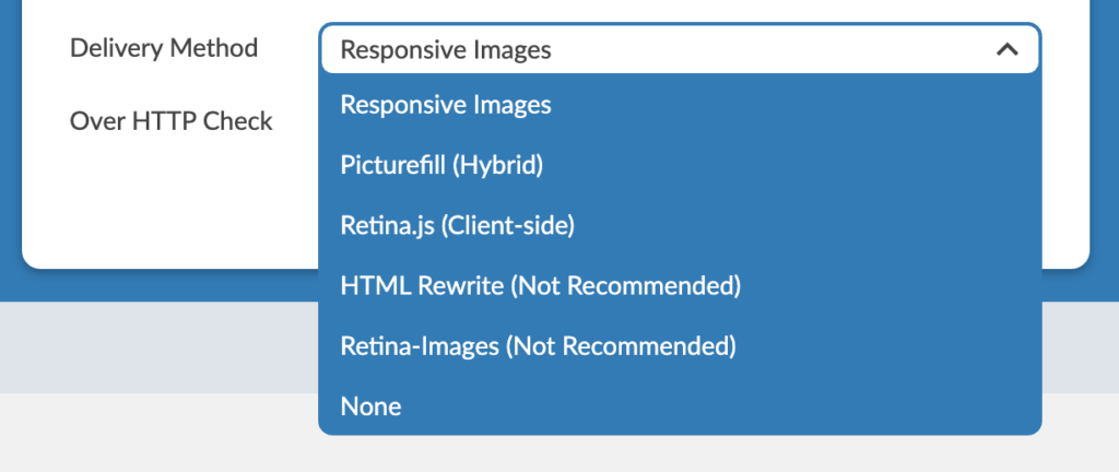
If you are using old (or badly coded) plugins, you might need to pick an alternative method. PictureFill is generally a good choice; it analyzes the HTML generated by your WordPress, look for images, and replaces those images by the Responsive Image system. On top of this, it adds a little script to support a browser that might not handle Responsive Images yet (you can disable this script through the options if you feel it’s useless). Retina.js, the client-side method, used to be very popular. It was even used by Apple website!
Note that none of those methods can be perfect. The ideal situation is that all the plugins and the theme you use are built on the Responsive Images system, and it will work perfectly. If not, you will need to find the method that fits your site the best, and fix the parts which aren’t working with small hacks (or let them be).
The icons, logo or images of your theme cannot usually be managed by the plugin automatically. You might have to upload manually a retina file for them or write some CSS. Serious themes already have support for this, usually. If they don’t, please contact them.
Retina Delivery Methods
PictureFill
The Picturefill method rewrites the HTML on-the-fly in order to use the new HTML tag called srcset. Since it is not supported by the browsers yet, the JS polyfill PictureFill is used to load the images.
For SEO purpose, you might want to check the Keep IMG SRC and Use Lazysizes options as well. The first will keep the original image in the src so that it can be seen my search engines (and other services). However, for retina devices, it means the images might be loaded twice (the normal image then the retina one). The lazysize will kick in and only load the retina files when the visitor actually gets closer to that image.
Responsive Images
This only works with WordPress from 4.4. From this version of WordPress, the src-set is created automatically for the images in the posts and the plugin adds the Retina images in it. Basically the parsing done by PictureFill (above) is skipped, which can increase the performance (but not that much since we are all using caching anyway). This option should be chosen over PictureFill only if your theme is extremely well-made but to be honest I don’t have examples of themes and installs that work nicely out of the box 100% Retina with only this option.
Retina.js
The Retina JS method is the 100% JS solution. The HTML loads the normal images, then if a retina device is detected, the retina images will be loaded. Images will be loaded twice, then will be as many requests as there are images (to check if the retina files exist). It’s not the best for performance but it’s not terrible neither. This method is used by many major websites on Internet such as Apple.
IMG Rewrite
The IMG Rewrite method rewrites the images’ SRC tags on-the-fly when a retina device is detected. However, since the HTML is rewritten, that method doesn’t play well with caching.
If you can negotiate with your hosting service or the developer behind your caching plugi) to handle a different cache depending on the retina cookie (devicePixelRatio), then you will get the fastest retina solution!
Retina-Images
This method is very neat as well but you will probably need to be a geeky user. The plugin will modify your .htaccess for this method to handle the requests to load the files. On the visitor side, all the images will look the same, there will be never @2x extension. The file sent by the server will however depend on the device. It’s a neat solution but it’s not for everyone as it might require some testing and sometimes, debugging. It also wouldn’t work with CDN.
Towards Image Perfection
I am sure you enjoyed this tutorial and Perfect Images until here if you love an optimized site. Here are a few more points.
Image Threshold
Since WordPress 5.3, images bigger than 2560px are resized automatically and renamed with -scaled as a suffix. It’s generally a pain, as WordPress keeps the file you originally uploaded, but doesn’t use it anywhere (and the full-size is different). If you are reading this tutorial, it means you know a minimum about WordPress, so this feature brought by WordPress is not for you.
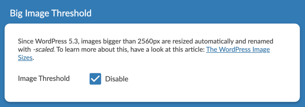
It was actually made for users who don’t know much to avoid uploading huge images by mistake. Enable that option to make sure this feature doesn’t mess with your site.
Image Replace
I am often replacing images by better ones, and I am always to enhance my sites. Enable this option if you would like to upload/replace photos easily. Once enabled, you can do this through the Perfect Images Dashboard. This make sure that all your thumbnails, Retina Images, and the related metadata are updated. If you are using our CDN offer, it will automatically use them (yay, no caching issues!).
Lazy Loading
This feature is here in Perfect Images but you don’t normally need it anymore. Since WordPress 5.5, lazy-loading is enabled by default, and it works with all modern browsers. You should also definitely remove the plugins which do this from your install.
We are all so different and so are our WordPress installs 🙂 It would be an error to think that everybody could use the same method to deliver Retina images. I always recommend to go for PictureFill (and it is the default) but this is not your only choice at all.
Optimize your Images + CDN
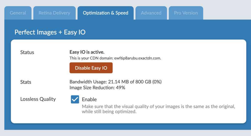
Perfect Images, through a very unique partnership with Easy IO (EWWW), has now it’s own offer. The idea is to provide an all-in-one service which doesn’t impact your install and really affordable. Basically, the perfect service 🙂 Here are the main features:
- Images are optimized (lossless, or not)
- The optimization are done remotely, your install is not impacted in any way (if you disable the plugin, everything is back like it was before)
- Serve WebP images whenever possible
- Very fast CDN with global delivery
- 800GB of bandwidth (which is probably more than you’ll ever need)
- Custom CDN domain (if you need it)
- No extra plugin needed, and one-click automatic set up
You can access this service through the Optimization & Speed tab in Perfect Images. Simply follow the procedure and it will work like magic.
