What happens to an image uploaded to WordPress? How are the thumbnails are created? What are those WordPress Images Sizes? I will try to reply to those questions as simply as possible.
The Process of Uploading an Image into WordPress
When you upload an image to WordPress, a new entry is created in the Media Library. But behind this, it is slighty more complicated.
In the Filesystem
At least 4-5 files are added in your filesystem (more specifically, in the /uploads directory, where your WordPress is installed). Those files are known as thumbnails, as they are smaller than the original file you have uploaded. In your filesystem, it will look like this.

Your original file keeps its name. The additional thumbnails are suffixed with their new dimension. Here, we have a square (150×150), and the others are reduced version of the original file. In fact, when you are looking at your Media Library (in List Mode), it is that square (150×150) image which is used.
In the WordPress Database
A new media entry is created in the database, and the associated metadata is generated. This metadata is very important: it contains the information about the files which were created, such as their dimensions, and their location.
Unfortunately, that metadata is not shown by WordPress. If you are curious about it, you can install Media Metadata and you will see a new column in the Media Library.

Here, you can see that your metadata contains the information about your thumbnails. Each thumbnail is associated with a name. Here, it’s medium, large, thumbnail, and medium_large. They correspond to the Image Sizes which were active at the time of the creation of the files and the metadata. We will dig into the Images Sizes soon.
Why is this happening?
Simply because your original file would be usually too big to be used directly on your website. Indeed, there are many ways to use an image, for example as a preview image when your posts are listed (in which the image appears small), or maybe in very big when it’s used at the top of your article.
Your theme or the plugins you are using, depending on the situation, will pick a different image to work with.
The Big Image Treshold
We are not done yet! Since version 5.3, WordPress resizes automatically your original image if it is bigger than 2560 pixels in width or height. This new image is called myfilename-scaled.jpg. This image is the one which will be used in your WordPress. The original myfilename.jpg will be also there, part of your files, but not used anywhere.
The way they did it is actually quite confusing; if you upload images smaller than 2560 pixels, they will not be scaled. So you might end with a mix of files with -scaled included or not in their names.
I strongly suggest you to disable this feature, in order to keep your filesystem clean and totally under your control. For this, you can simply use the Perfect Images plugin. You can also use the following code.
add_filter('big_image_size_threshold', '__return_false');The Images Sizes
Welcome in the messy world of the Images Sizes! 🙂
The Standard Image Sizes
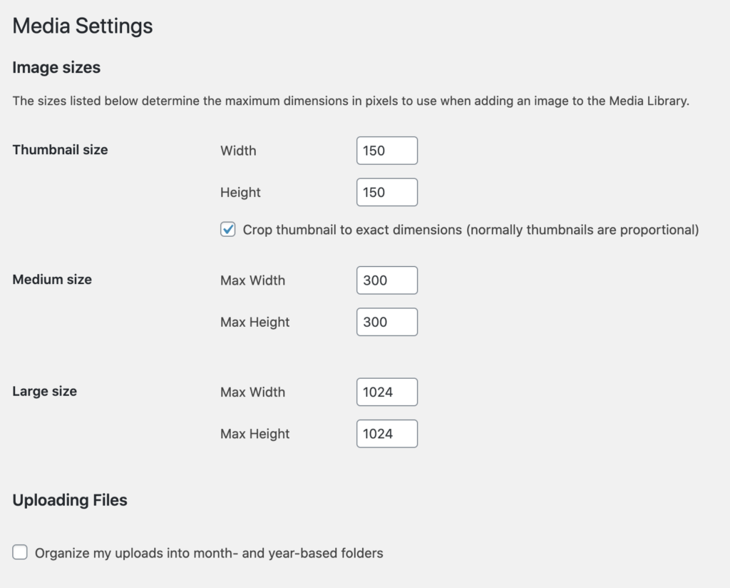
It’s very easy to check the image sizes registered by default in WordPress. They are accessible under Settings > Media. There, you can modify their dimensions. By the way, I highly recommend you to check the Organize my uploads into month option!

But that’s not all. You probably noticed it before, but in the screenshot of the metadata I shared with you earlier, there was a medium_large size. It is not displayed here (even it is part of the standard sizes), and you can’t pick it anywhere. So why is it there? Why are you making everything so complicated, WordPress!? Well, it’s actually an attempt to make things a bit simpler (and they don’t tell you about it), and this size is used to enhanced the Responsive Images feature (check the section about it to learn more).
The Additional Images Sizes
And now, there are all the additional image sizes added by your theme and the plugins. For example, WooCommerce adds 3 more image sizes. They talk about this in their documentation: WooCommerce Image Sizes for Theme Developers.
I worked on a plugin called Perfect Image. It allows you to see all the registered sizes, and to even disable them. Please read about it here: Manage your Image Sizes with Perfect Images.
Responsive Images
Nowadays, there are many ways of browsing a website, with many different kind of devices. When you visit a website at home, on your big screen and with a very fast connection, you would be probably happy to see beautiful and crisp, large images. However, when you are on a trip with a somewhat slower connection, you would prefer to see a smaller image (since your device has a small screen anyway), and maybe even lower quality.
Support in WordPress
Luckily, since WordPress 4.4 (back in… 2015!), there is support for Responsive Images. If your theme or plugins take advantage of this feature, then your images will be responsive images.
How does it work exactly?
This part is a bit technical. When an image is being written into the HTML through the WordPress system, instead of just a src in the img tag, a src-set is used. All your images sizes are added into this src-set. Then, automatically, the browser of the visitor will pick the best suited images, depending on the size of the screen and the device connectivity.
If you are curious, here is an example of an image with a src-set.
<figure class="wp-block-image size-large"><img loading="lazy" width="819" height="1024" src="http://website.com/wp-content/uploads/2020/09/autumn-in-japan-819x1024.jpg" alt="Autumn in Japan" class="wp-image-360" srcset="http://website.com/wp-content/uploads/2020/09/autumn-in-japan-819x1024.jpg 819w, http://website.com/wp-content/uploads/2020/09/autumn-in-japan-240x300.jpg 240w, http://website.com/wp-content/uploads/2020/09/autumn-in-japan-768x960.jpg 768w, http://website.com/wp-content/uploads/2020/09/autumn-in-japan.jpg 1080w" sizes="(max-width: 819px) 100vw, 819px" /></figure>


